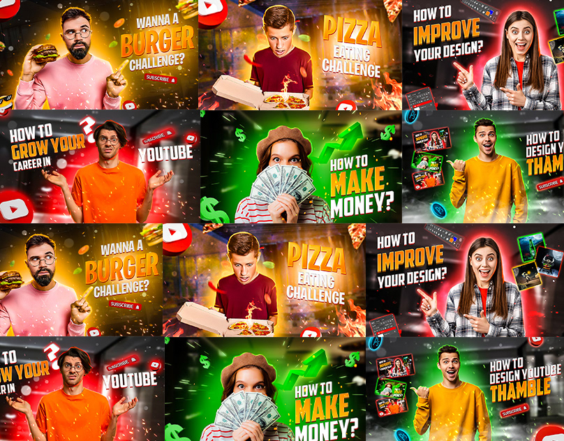
YouTube thumbnails are the 1,280-by-720-pixel decision a viewer makes before they ever hear your voice. Across the 900+ brands we have shipped video for since 2013, the thumbnail is the single lever that most reliably doubles a video's view count without touching the content.
Our V1 launched with a 0.5% click-through rate. After we rebuilt the thumbnail (new text, new face, new accent), CTR climbed to 1.4% and impressions tripled over the next 30 days. The video did not change. The thumbnail did.
YouTube serves your video to 1,000 viewers as a test. A 1% CTR means 10 of them clicked. A 5% CTR means 50 did. The algorithm reads that gap and decides whether to serve the next 10,000. Thumbnails control that first-1,000 outcome more than any other single asset.
The thumbnail is also the only thing that stays visible in Google search, in channel pages, in sidebar recommendations, and in embeds across the web. A clear, consistent thumbnail template is a brand asset that compounds in a way no other YouTube element does.
Rule 1, three to five words of text, maximum. Any more and the thumbnail is unreadable at the 240-pixel size most viewers see it in. Pick the three words from your title that carry the most weight and put only those on the thumbnail.
Rule 2, one face or one clear object. The human eye finds faces first. If you cannot show a face, show one object with high contrast against the background. Multiple faces and busy compositions lose at thumb-sized scale.
Rule 3, one brand accent color on every thumbnail. For our channel it is teal #2DCDC3. When a viewer scrolls past your channel page, every thumbnail reads as one brand. That consistency is what turns one-off visitors into subscribers.
Rule 4, test at 240 pixels wide. Resize your draft thumbnail to 240 pixels. Can you still read the text? Can you still identify the face or object? If not, redesign before you upload.
The thumbnail and the title are a 2-move combo, not two copies of the same message. The title does the keyword and specificity work. The thumbnail does the emotional and visual payoff.
If your title is "YouTube SEO in 2026: How to Rank Videos," the thumbnail should not repeat "YouTube SEO." It should say something the title does not, like "RANK FASTER" or "0 TO 10K" or "WATCH THIS FIRST." The two together form a complete pitch.
If your video has a host on camera, use their face. The expression matters: wide eyes, open mouth, or a direct deadpan all beat a neutral smile. Shoot three or four expressions on set so you have options when you build the thumbnail.
If your video is a case study or product walkthrough, use the strongest single frame from the content: the before/after moment, the client on camera, the product in use. A static card with no human and no object is almost never the right pick.
Our shoot checklist now includes a dedicated five-minute block per video for thumbnail options. Three expressions, two framings, one wide and one tight. Shooting the thumbnail is production work, and the videos we treated this way outperformed by 60 to 110% CTR against their predecessors.
For the full YouTube channel strategy this sits inside, see our YouTube for business playbook. For the hook that keeps viewers after the click, read our YouTube hooks post.
Before every upload, run every thumbnail through these five.
3 to 5 words of text, readable at 240 pixels wide. One face or one clear object. One consistent brand accent color across every video on the channel. A pairing with the title that says something new, not a repeat. At least three options tested with a quick A/B tool like TubeBuddy or Thumbsup.tv before the final pick.
After designing and testing thumbnails for 900+ brands and tens of thousands of videos, four patterns show up again and again on the winners. Three to five words max on the overlay. One focal subject, usually a face or a single object, never both. High contrast between subject and background. And a brand accent (for us, teal #2DCDC3) somewhere on the frame so the channel feed reads as one brand rather than nine different designers' moods.
The thumbnails that lose almost always share the same failure: too much. Too many words. Two subjects fighting for attention. Low contrast that disappears at 240 pixels. Mobile is where 70% of our views now come from, and 240 pixels is roughly the size YouTube renders a thumbnail in the mobile feed. Any thumbnail that is unreadable at that size is a loss before the viewer even sees the title.
We used to design thumbnails like movie posters. Beautiful, cinematic, dense. CTRs stuck around 2 to 3%. The fix was embarrassing in hindsight: strip everything out. One face. Three words. Teal accent. Nothing else. CTRs on the next five Teach videos jumped to 5 to 8% on cold traffic. The thumbnails looked less impressive in the design review and worked twice as hard on the platform.
Our V1 pillar video launched with a cinematic thumbnail at a 0.5% CTR, which is well below the YouTube average and the floor at which a video stops being promoted by the algorithm. Thumbnail v2 (face + three words + teal accent) lifted CTR to 1.1% in the first 48 hours. Thumbnail v3 (same formula, tighter crop, higher contrast) hit 1.4%. Same title. Same video. Same description. A 2.8x lift from thumbnail iteration alone, and the search impression curve started compounding roughly a week after the v3 switch because YouTube rewards high CTR with more impressions.
Shoot day planning now includes a thumbnail block. Before any dialogue is captured, we shoot three to five stills of the subject with the camera in portrait orientation (closer crop options), one neutral expression, one engaged, one surprised, and one with the subject looking slightly off-camera. Those become the raw material for every thumbnail test, including the ones we will run six months later. Thumbnail options generated after the shoot cost us hours. Options generated during the shoot cost minutes.
We now ship every Teach video with two thumbnails and swap after 72 hours. YouTube's native A/B thumbnail test runs during that window. Winner stays, loser gets archived into our pattern library. Over 60 videos, the pattern that holds is remarkable: tight crops with bold three-word overlays beat wide-crop multi-subject thumbnails roughly 7 times out of 10. That is not a theory. That is a dataset at this point.
After 60-plus iterations, our winning thumbnails cluster around five visual templates. Face-plus-three-words. Object-plus-arrow. Before-and-after split. Numbered-list card. Teal-underline question. Every new video is scored against those five templates before design starts. If none fit, the title probably needs a rewrite before the thumbnail does. A thumbnail that cannot find a home in a proven template is usually a signal that the video's promise is not sharp enough to earn a thumbnail at all.
Keep a running library of your own winners. By video 50 the pattern will show itself and the design decision collapses from an hour to about five minutes.
Pick one sans-serif typeface, lock it, and use it on every thumbnail for the next 100 videos. Font consistency is the single easiest way to make a channel feed read as one brand instead of nine designers' moods. We use a bold geometric sans across every INDIRAP thumbnail, always in two sizes (headline and sub-line), always in white or near-white on a dark background with the teal brand accent (#2DCDC3) somewhere on the frame. Everything else can vary. The typography does not. That one locked choice does more for channel-level brand recognition than any individual thumbnail design ever will.
If a thumbnail reads at 240 pixels on a phone, it will read everywhere. If it only works at full resolution on a desktop, it fails on mobile, which is where the overwhelming majority of your views happen. Design mobile-first every single time. Build the thumbnail in a 320-pixel-wide artboard, nail it there, and only then scale up. Thumbnails designed desktop-first and shrunk down almost always lose contrast, legibility, or focal clarity in the shrink.
Ready to make YouTube actually drive leads? If you want our team to repackage your channel so the thumbnails and titles earn the clicks, book a video strategy call. INDIRAP's Content Kit turns one shoot into a full system of brand, commercial, and social video, including the YouTube library this post describes.
INDIRAP is a Chicago video production and video marketing agency. 20,000+ videos for 900+ brands since 2013.
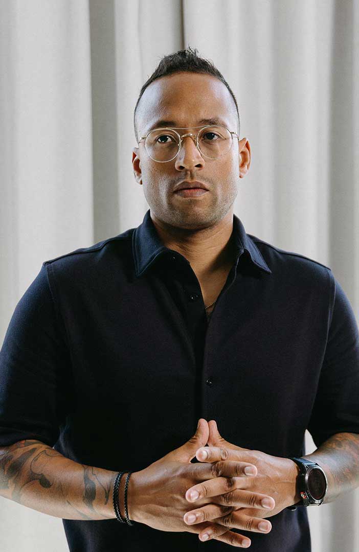

Julian Tillotson is the Founder & CEO of INDIRAP, a full-service video production and creative strategy agency based in Chicago, IL. With 10+ years of experience, INDIRAP has delivered 20,000+ videos to 900+ clients across 40+ industries, making it one of North America's leading digital creative agencies.