
Web design in 2026 feels less like a race for novelty and more like a conversation between people and screens. Users have grown impatient with noise, heavy visuals, and clever tricks that slow them down. What they want is pretty simple: fast-loading websites that feel calm to look at.
This year, design choices tend to feel quieter. Interfaces seem to be stepping out of the way rather than overwhelming users. Typography carries more responsibility than before. None of this screams for attention, and that’s the point. Rebekah Read, a Squarespace web designer, says that visual overload is a no-no in 2026, and although there’s a return to minimalism, it’s done more strategically.
That’s exactly what you need to replicate in your websites. But for that to happen, you need to be familiar with website trends of 2026. Let’s discuss them in detail.
In 2026, keeping visitors interested goes beyond making pages look up-to-date. Users expect sites to respond to their actions. Simple adjustments like thoughtful feedback on buttons or scroll responses help users feel involved in their online journeys.
Web designers are also leaning into tailored experiences that adjust content and layout to match user behavior in real time. This is in line with organizations realizing that personalization, particularly AI-driven experiences, are the way forward to meet customers’ needs. In fact, 67% have made personalization a top priority for them.
Besides personalization, fast load times and thoughtful structure give users a reason to stay. Here’s a look at website trends 2026 you must make a part of your campaigns.
In 2026, many designers are moving away from rigid boxes and predictable columns toward visual systems that feel less mechanical and more personal. Interfaces now use smooth contours, gentle curves, and transitions between irregular shapes.
These elements make digital spaces feel more like visual journeys than rigid screens. Designers use subtle layering, blurred forms, and softly blended color tones to craft compositions that have movement. Here’s an excellent example from Gufram.

Their website also has two versions. Visitors can switch between grid and space to find the interface they like.

Color blends and atmospheric gradients also play an important role. Designers are now opting for layered tones that shift gently across a section or around key content. These gradients can help lead a visitor’s eye to important areas without shouting for attention.
This trend isn’t limited to screens. Fashion designers are also drawing inspiration from the natural world, selecting earthy tones and flowing silhouettes rooted in nature. In the food and beverage world, packaging and menus use hand-drawn motifs and curved shapes to reinforce the desire for human presence in visual experiences.
Begin with the basics. Swap hard-edged panels for soft contours on major sections like headers, footers, or content cards. Try layering lightweight translucent shapes under or around key elements to give a relaxed look to the page.
Then, break traditional column structures by floating visuals. More importantly, maintain clear spacing and hierarchy so that content remains easy to digest.
One of the latest web design trends 2026 revolves around energetic color choices that draw attention. Good news: we’re not shying away from colors anymore. Bye bye, beige aesthetics!
After several years where muted tones and restrained palettes dominated digital experiences, designers are now experimenting with bright, high-saturation hues that feel lively and optimistic. Designers are using these palettes especially in sectors like fashion, entertainment, lifestyle, and youth-oriented brands where a sense of energy can enhance engagement.
Cuppa Pug’s website is a beautiful example of this in action.

These bright palettes often take inspiration from cultural and lifestyle domains outside of web design itself. In interior and fashion forecasting, energetic colors like vivid yellows, electric greens, and bold purples are emerging as mood-boosting choices for 2026. The following video sheds more light on this.
Experts identify these shades as a shift toward expressive visuals that signal personality, joy, or nostalgia. In practical use, dopamine colors can be incorporated through gradients, background accents, button highlights, illustrations, and other interface elements that benefit from added emphasis.
Hydra’s website is among our favorites in this regard.

Start by selecting a bold primary accent color that aligns with your brand’s personality and objectives. Use it sparingly in key interface elements like calls to action, navigation highlights, or interactive buttons to guide attention.
Combine this primary tone with supporting hues that contrast well and maintain legibility on text or icons. When using gradients, keep transitions smooth to avoid visual fatigue. Make sure you test color contrast for accessibility so that all users can engage comfortably.
We love Starface’s website for inspiration.

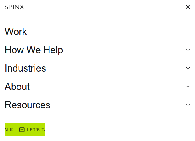
Modern web design trends 2026 are all about keeping visitors engaged. And one way websites are doing this is through subtle effects, often just a few pixels of movement or momentary visual feedback. These effects respond to user actions like clicks, hover, scroll, or form input and help users feel understood by the interface.
They provide immediate feedback that informs users that an action was heard and acted upon. For example, a button might slightly shift in size or glow when clicked, or a progress indicator might animate just enough to show that the system is processing the request.
It doesn’t even have to be something big. On Spinx’s website, the “Let’s Talk” button is a mobile banner.
Psychological research also supports this direction. Motion naturally attracts human attention, so thoughtfully placed animations guide the eye and help users understand what just happened. Plus, subtle cues reduce confusion and can help users make decisions faster.
Begg’s website does animation quite well. When you land on the website, it shows the page loading (going up to 100%) and then the hero text slides into view.

First, identify key moments where users take an action, such as clicking a button or submitting a form. Then, add visual responses tied to these moments. Keep motion subtle, though. It should support understanding instead of drawing attention away from content.
For example, when you click the “Shop Sale” button on Lemme’s site, the button changes color. It’s simple, but lets the visitor know that their action has been registered.

Use CSS transitions and lightweight animation libraries to minimize load impact. Also, test motion on different devices and disable or tone down movement for users who prefer reduced motion.
Among the 2026 website design trends, emphasis on striking typography is one of the most noticeable shifts in visual communication. Designers are no longer treating text as a background element or silent messenger. Instead, type itself has become a primary visual asset that can define tone and personality in a site’s layout.
Abetka UA’s website does a splendid job of this.

Large, heavyweight fonts with dramatic presence help guide users’ attention and make messages instantly recognizable. This approach fits well with minimalist layouts where content is given space to breathe. So, the bold type can do much of the visual work without overwhelming other elements.
Here’s a good example from a Github website.

Bold typography doesn’t just mean bigger letters. It also includes expressive treatments like striking letterforms, contrasting weights, mixed styles, and creative placement. These font styles can be particularly effective in hero sections, landing pages, and key calls to action.
Another emerging aspect of this trend is the inclusion of kinetic and variable typography. This text changes in response to user behavior or screen site. It adds another dimension to text’s role, using motion or variation to communicate mood or emphasis.
Select a few strong typefaces that align with your brand’s character, and use bold typography for key content areas like headlines and call to actions. Then, pair heavyweight fonts with simpler body text to create hierarchy and avoid visual overload.
If you want to add dynamism on your website, use variable fonts or subtle motion effects. Test the contract and spacing to confirm accessibility so bold visuals serve aesthetic and user needs.
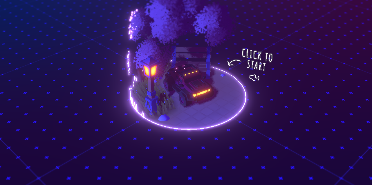
One striking theme among the 2026 website design trends is the move away from plain vertical scrolling toward more imaginative ways of moving through content. Traditional scrolling still has a place, but many designers now blend vertical movement with horizontal shifts, parallax layers, and long-scroll storytelling. The following video explains how this works.
These alternative techniques encourage users to interact with content. For example, horizontal panels might slide in at certain points, or the background and foreground might move at different rates, to give a subtle sense of depth.
We love the interactive scrolling experience Bruno-Simon’s website provides.
Parallax effects remain a popular tool within this trend. When implemented thoughtfully, parallax can make content feel layered and alive. Background elements can move more slowly than foreground visuals, which gives a hint of dimensionality.
Some designs also embrace horizontal scrolling, particularly for specific sections like galleries, timelines, and product showcases. This mixed directional approach adds variety to the flow of information and can help break monotony, especially on long pages. We see this on Ispy’s website, where you move the hero images horizontally to screen.

Look for areas where non-traditional scrolling can add clarity or surprise without disrupting usability. For example, a product gallery could slide sideways while the main text continues down.
Parallax backgrounds can add subtle depth if their motion rates are slow and support readability. Use CSS libraries or scroll-trigger tools that help animate elements based on scroll position. Don’t forget to test across devices, because touch and wheel interactions can feel different.
Many designers and creatives are looking back to the 80s for inspiration, and not just in visuals on screen. That decade had a vivid mix of bold geometry, playful graphics, and confident use of color that now resurfaces across web interfaces.
Diko goes all out with this trend.

On modern sites, you’ll see neon‑toned accents, geometric patterns, and pixel‑inspired motifs that echo early digital aesthetics while still feeling fresh. This nod to the past is in line with people’s nostalgia of the “good times.” Overrrides does this better than any other site.

This blend stretches into interiors and decor too. Retro‑inspired lighting, furniture silhouettes, and color pops give rooms a lively pulse that contrasts with minimalism. All these expressions point to a cultural moment where designers and audiences find excitement in revisiting the past while building something new.
Introduce neon and bright accent colors in hero sections or buttons to give pages instant energy. Add geometric or pixel-inspired graphics as decorative elements.
As for typography, use retro-inspired options for headlines. Use subtle motion or hover effects on shapes and icons to bring interactivity in line with the playful aesthetic.
AI‑generated website design is one of the most talked‑about website design trends 2026. This is no surprise since the AI-generated content market is forecasted to reach an impressive $80.12 billion by 2030. It represents a shift in how sites are created, moving design from manual crafting to a collaborative process between humans and intelligent tools.
In this context, AI‑generated doesn’t just mean auto‑producing pages from a prompt, though that is increasingly possible. Modern platforms blend smart suggestions, layout generation, and real‑time adaptation into everyday design workflows. For example, some builders now use natural language prompts to produce full layouts that they refine afterward.
MyPartyChef used an AI builder to create this functional website.

AI also enhances decision‑making during design. Tools can suggest better typography, balance color contrast, or reorganize layout elements based on predicted user interaction patterns. The best part is there are plenty of free tools to use. Figma’s Make is a good example that helps you get started quickly. The following video explains how to use it.
To use AI‑generated design effectively, start by choosing tools that allow prompt‑based layout creation while still giving you final editorial control. Provide clear guidance in your prompts about brand voice, audience needs, and content priorities so the AI produces relevant suggestions.
After initial generation, refine the layouts manually. Use AI’s ability to personalize content paths by setting rules that adapt visuals and interfaces to different visitor segments.
If all goes well, you’ll have a gorgeous website like this that we absolutely adore.

Unlike static text or images, video delivers both motion and narrative in a compact form. So, it’s no surprise that its use is one of the current web design trends 2026. Visitors absorb visuals, sound, and spoken information far faster than they read paragraphs.
Research shows that videos on landing pages can increase conversions by 86%. That’s a lot! Not every brand is using video on the product pages alone. Some are using it in the background of their home pages to bring some movement to the otherwise static page while showing their product in action. Mooi does this quite well.

While video is powerful, it still needs to fit the context of your landing page. Too long or too slow to load and visitors may leave before they watch.
Short brand videos or explainer clips that show your core message quickly work best. On mobile especially, responsive video players and lightweight hosting help keep performance strong.
Create a brief video that highlights your offering’s key value. Keep it under 2 minutes and make sure the opening seconds answer a core question your visitors have.
Position it near the top of your page so users see it right away, and pair it with a strong call to action that relates to the video’s message. Use efficient hosting and compression to keep load times low, especially on mobile. You can also add captions for accessibility and use A/B testing to see how different video content performs against traditional layouts.
.gif)
The best web design trends 2026 show that websites are moving beyond static layouts. Colors, typography, and motion now work together to create lively experiences. Micro-interactions and AI-generated designs engage users right off the bat, while non-traditional scrolling and ’80s-inspired visuals add personality and energy.
Among these website trends 2026 is the use of video on landing pages. These videos may show your processes and services, or give a view of your product briefly.
Need help creating these videos for your website? INDIRAP is at your service. As a results-driven video production agency, we not only help you follow the latest web design trends 2026, but also make sure they deliver the outcomes you want.
Book a strategy call with us to jump the trend bandwagon in 2026.
Web design trends 2026 include bright dopamine colors, organic shapes and anti-grid layouts, bold typography, micro-animations, AI-generated design, and video on landing pages. These trends focus on engagement and interactivity to create memorable digital experiences.
Micro-animations provide subtle feedback for user actions like clicks, hovers, or scrolls. They create a responsive, interactive experience for visitors and guide their attention. Plus, they make websites feel alive, which seems to be one of the modern web design trends 2026 that businesses are focusing on.
AI tools generate layouts, suggest typography, adjust spacing, and personalize content in real-time. Designers save time on repetitive tasks, can focus on creativity, and adapt websites efficiently to audience behavior and preferences. AI also improves consistency, speeds up production, enhances user experience, and supports data-driven decision-making in web design.
Experiment with color, typography, motion, and layout while keeping usability in mind. Test AI-generated elements, video, and interactive features. While you’re doing this, balance creativity with readability to create sites that engage visitors and leave lasting impressions.
Absolutely. Videos capture attention instantly and can communicate your message faster than text alone. They also show your product and create an emotional connection with the visitors. Besides product showcases, you can also use video to explain complex ideas and share customer testimonials that build trust.


Julian Tillotson is the Founder & CEO of INDIRAP, a full-service video production and creative strategy agency based in Chicago, IL. With 10+ years of experience, INDIRAP has delivered 20,000+ videos to 900+ clients across 40+ industries, making it one of North America's leading digital creative agencies.


.png)
.png)