
The world of web design is dynamic. New trends and techniques are constantly emerging. You need to be on top of your game to adapt to these new web design trends.
It's more than just adapting to new tactics. You also have to incorporate intelligent and interactive features in your digital presence to attract users and stand out against the competition.
But what are the current trends in website design? Below, we look at the latest website design trends from which you can take inspiration.
Just a preface: you don't necessarily have to follow every single one of these trends in your website design. After all, the best web design is one that reflects your brand.
However, incorporating some of these 2024 website design trends will keep your website looking futuristic and fresh. Let's take a look.
For the past few years, minimalism has been the go-to style for all sorts of design, be it for the website or your home. Beiges and whites have been the color of choice, while minimal website elements helped to declutter the user interface.
But we're soon going to see maximalism as one of the most notable website design trends.
Maximalism, as the name suggests, is all about adding more to your design. Bold colors, intricate patterns, and layered designs will make a comeback.
Think express typography, 3D elements, vibrant color combinations, dopamine colors, and loud graphics.
Example: Molly Baz's website is a great example of maximalism in web design with its use of bright orange and bold fonts.

Just as minimalism is making an exit, unicolor designs are going down as well.
In 2024, we're expecting to see gradients make a comeback in website design. Gradients add depth and dimension to a design, making it visually appealing.
But we're not talking about the old-school monochromatic gradients of the past. Instead, we're looking at vibrant and bold color combinations that create a sense of movement on the screen.
The gradients will be coupled with uncommon fonts for a sense of uniqueness.
Example: Memory Work's website is a gradient galore. You can see that the font is pretty funky, too.

Example: Worksmith's website is another example. It uses a minimalistic design and simple fonts, letting the gradient background shine through.

In 2024, website visitors will expect more than just a static website.
Scrolling effects are an emerging trend that adds interactivity and engagement to a website. An example is parallax scrolling, where the background image moves at a slower pace than the foreground elements, creating an illusion of depth.
Other scrolling effects could include scroll-triggered animations and interactive illustrations that respond to a user's scroll and mouse movements. These scrolling effects add an element of surprise and delight, making the website experience more dynamic.
Example: Dice uses a fun scrolling effect on its website. As you scroll down, the rotating shape on the homepage also moves.

Struggling with your video creation strategies? Check out this complete video checklist.
.gif)
An often overlooked web design trend is world-building. Many web designers think world-building is only limited to social media campaigns or video game design, but it can also be applied to web design.
Branded word-building in web design creates an immersive experience for visitors with visuals and design elements. For example, if your brand is playful and whimsical, your website's world-building could include illustrations and animations with a similar style.
Example: Futurewise does world-building on its website splendidly. For example, as you go to the ''slugging'' portion of their skincare website, a slug appears on the screen. Why? Because their products are called ''Slug Boost'' and ''Slug Balm.'' So, their whole website follows the theme of slugs and nature.

TikTok users have hailed the previously-loved whites as ''sad beige aesthetic,'' which in turn has led to the rise of pastel colors. In web design, this trend is making an appearance with the use of soft, pastel colors in backgrounds, typography, and overall design.
Aren't ready to make a drastic transition, yet? No worries. You can add a touch of pastel by using them in small design elements such as buttons or icons.
Example: Gentle Guide uses pastel pinks and browns in its web design. In fact, the company follows two trends we've mentioned in this list: gradients and pastel colors.

Experimental navigation is one of the many current website design trends that are a bit tricky to pull off but are visually stunning when done correctly. Navigation bars and menus that break the traditional boundaries of top, bottom, left, or right-aligned options are becoming increasingly popular.
Designers are experimenting with different shapes, sizes, and placements of navigation elements to create attention-grabbing designs. We're talking about circular menus, hidden navigation, and even interactive options.
Example: Anand Upender's portfolio website is a good example. As you scroll on the hero section, you'll see a background picture of him moving left and right based on your cursor's movements.
Another example is the Human Things website. The navigation menu spans from the top to bottom on the left side of the screen. As you click on an era of human history, its relevant information is shown on the right. Each page also has a different color scheme that complements the selected era.

Kinetic typography simply means moving text. Instead of using static text, designers are using animation to bring words to life.
The trend was originally introduced in the 60s in films where animated opening titles became popular. It has now made its way into the digital world.
You don't have to make the text move all around the screen to create a stunning effect. Simple animations like fading or rotating the text can add that extra oomph to your website.
Use kinetic animations in important sections like headers, call-to-action buttons, or even in your logo. You can also use them to guide the user through your web pages.
Example: Gravity Global uses kinetic text on its website. When you land on the home page, the hero text starts appearing. Then, the word ''opportunity'' is circled to show that Gravity Global is all about creating opportunities.

It shouldn't come as a surprise that AI use is also one of the website design trends 2024. AI has made its way into most walks of life, and website design is one of them.
Now, you have a host of tools like Jimdo and Wix AI to create landing pages that have a human touch without even touching a line of code. You can even add AI-generated content to your website, including blogs, images, videos, and more.
In 2024, you can expect to see more AI-generated websites. Sure, AI can't create a website to perfection yet.
However, it can act as a starting point. You can go in and make tweaks to your website, making it more personalized and unique.
Example: Adams Construction Group has created its website using the Wix ADI (Artificial Design Intelligence) tool. The company has used the AI tool to create three pages: a home page, a contact page, and a client page.

Here is a video tutorial to help create a website with Wix ADI
The Y2K era is coming back, not merely in fashion but also in website design trends. Be prepared to see more bright colors and retro graphics in website designs.
But why Y2K? The nostalgic feel of Y2K designs appeals to the younger generation, which grew up in the 2000s. In 2024, this is the generation with the purchasing power. So, it makes sense to cater to their tastes and preferences when designing websites.
Another reason for the return of Y2K designs is the rising popularity of vintage aesthetics. With the rise of vintage fashion and music, it was only a matter of time before it made its way into website design as well.
You can add Y2K pop-culture references, memes, stereotypes, or even typography to create a playful feel on your website.
Example: Byline's website screams Y2K with its retro graphics and font choice.

Example: Take a look at the Boys Club website and tell us it's not right out of a Y2K magazine. The website has fully embraced the nostalgic trend with its bright colors and vintage graphics.

If you keep up with TikTok trends, you'd know about viral concepts like ''I'm just a girl,'' and ''girl aesthetic,'' and ''that girl.''
GenZ isn't sticking to their predecessor's ''decent'' aesthetics. They are embracing bold, unapologetic femininity.
That means the whites and muted tones are being replaced by bold, saturated colors like hot pink, magenta, and electric blue. If you're planning to design a website for a brand geared towards women, don't shy away from using these bold colors and feminine elements.
Example: Air Milkshake does this website design trend best. The pink skies floating in the background, coupled with the messaging app screenshot in the front, perfectly encapsulate the femme fatale aesthetic.

Example: Coachtopia is another example. It has got quirky female characters, pink hair, a colorful fictional world, and funky colors.

Speaking of website design trends, layering will become a big deal in 2024. In simple words, this means layering shapes, animations, colors, and images on top of each other to create depth and visual interest.
Layering takes your simple-looking and flat design to a whole new level. For example, if you are creating a website for a restaurant, instead of just using images of food and text, you can layer them with different colors and animations to create a more dynamic design.
Example: SIRUP, a singer-songwriter, uses layering on his website. You can see how his own image is layered on top of the hero text. The colors are also layered, and the gradient further adds to the depth of the design. As you scroll down, you'll see a scrolling effect to display the artist's previous work. That's another one of the website design trends we mentioned earlier.

Toggles were previously considered one of the mobile website trends. But now, you'll see more of them on desktop sites, too.
So, how do you use a toggle? Let's say your website is in light and dark mode. Instead of having a button for each, you can use a toggle that switches between the two modes.
Similarly, if your website has a feature that can be turned on or off, a toggle switch is the perfect way to display it. It saves space and adds a fun interactive element for users.
Example: Lusion Labs uses a toggle switch on its website that lets visitors convert the grid layout to a list view.

Animations have always been a part of website design trends. But in 2024, we'll see more and more brands using them to convey ideas through illustrations. In fact, animation is one of those B2B website design trends that can help simplify complex ideas.
For example, brands that have a complicated or abstract concept can use animated illustrations to make it easier for users to understand. These animations also make your website more fun.
Example: New Action has a fun site with animations on the home page. Initially, the animations are static. But when you hover over them, they come to life and wiggle around.

With that, we've come to the end of our selection for the top website design trends in 2024.
The trends in web design aren't hard and fast rules that you have to follow. They are simply suggestions that can help your website stand out and improve user experience. Many websites rebrand when new website design trends emerge.
You can do the same in 2024 to ensure your site doesn't look outdated. When selecting which trend to adopt, keep your target audience in mind.
For GenZ, opt for modern website design trends with GenZ-speak. Similarly, baby boomers and Gen X prefer classic designs that are easy to navigate. Go with what works for your brand.
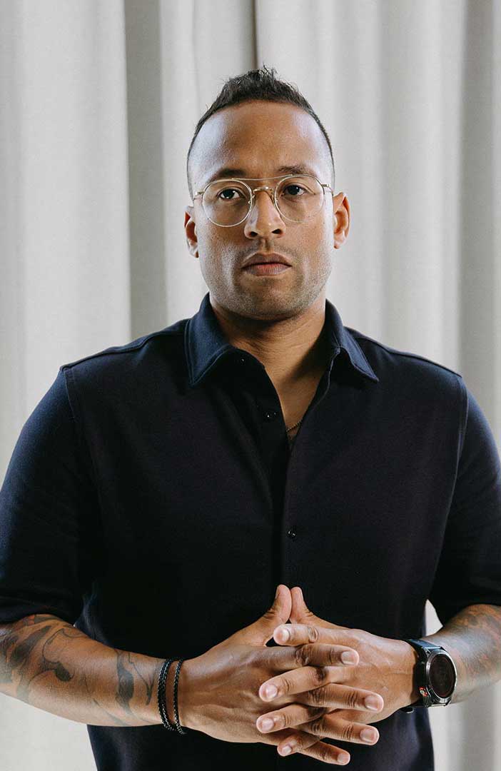

Julian Tillotson is the Founder & CEO of INDIRAP, a full-service video production and creative strategy agency based in Chicago, IL. With 10+ years of experience, INDIRAP has delivered 20,000+ videos to 900+ clients across 40+ industries, making it one of North America's leading digital creative agencies.


.png)
.png)